How I Designed the Voice, Brand, and Content of Atlas.md
Doctor, Heal Thy Brand
When working for Kansas-based design studio Entermotion, I was tasked with giving our healthcare app Atlas.md a new voice. We wanted something that felt less clinical (ironic, for a healthcare app, I know), and more human.
So I started digging into what everyone else was doing.
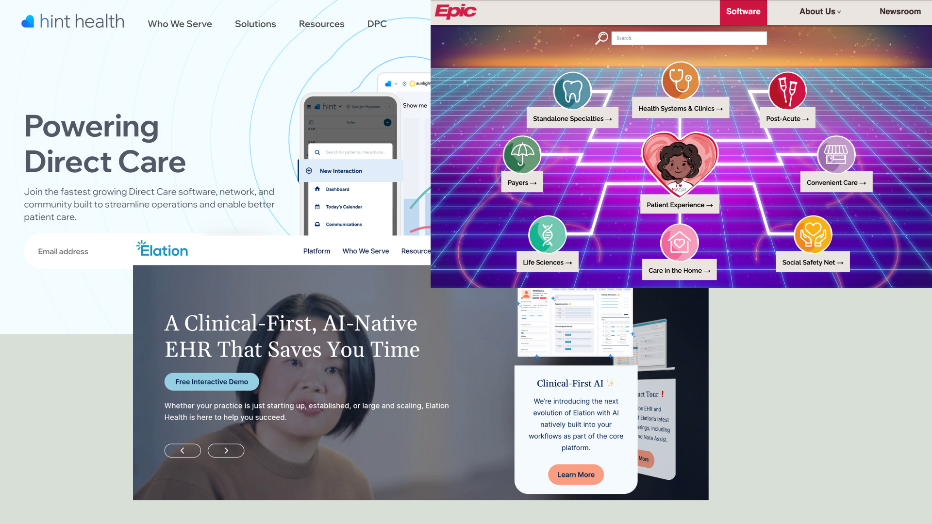
I found the first, glaring problem in a competitor's headline:
"Powering Direct Care."
It was one of those lines that technically made sense but didn't really say anything.
When I looked around at other healthcare tech sites, they all felt the same. Feature lists. Technical specs. Nobody seemed to be talking about what doctors actually cared about, which was just having more time with their patients.
So logically, this was the angle I knew we had to take.
3. Finding What Worked
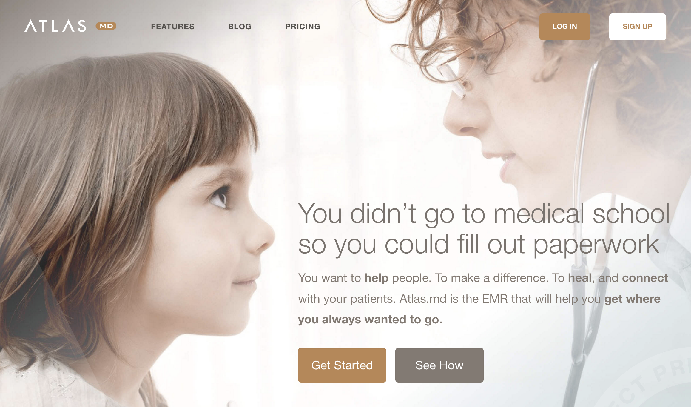
I went through so many bad headlines before I landed on: "You didn't go to medical school so you could fill out paperwork."
There was something about that line that just felt right. It named what doctors were feeling. It validated that frustration. And then it hinted at a way out.
The copy that followed tried to reinforce that feeling: "You want to help people. To make a difference. To heal, and connect with your patients. Atlas.md is the EMR that will help you get where you always wanted to go."
We weren't really describing what the software did. We were reframing why someone would even want it in the first place.
There's actually research showing that ads with stronger emotional responses generate about 23% more sales. The aspiration got people interested. The actual strength of the software kept them around.
That’s why I decided on this route in the first place. I wanted to speak directly as to why Atlas.md would change their professional life, rather than how it was going to do it. The how would come later (on a seperate features page and in the support library, but more on that below).
With this copy, I wanted to demonstrate how using Atlas.md would make a doctor feel. Less paperwork. Less burnout. More time with patients. Deeper purpose. I was selling them a lifestyle rather than just a piece of software.
5. Support That Actually Supports
The sales site was all about selling the idea of the life these doctors would have. How much time they'd save. Better patient relationships. Better care.
There was still the technical side, though. How things actually worked.
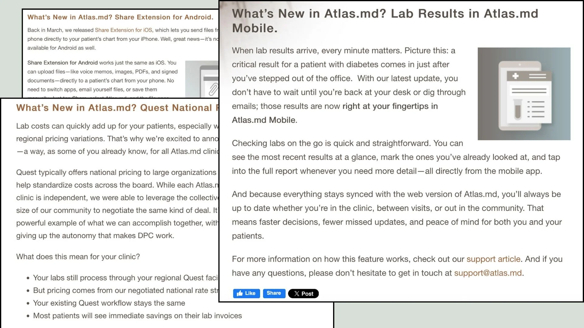
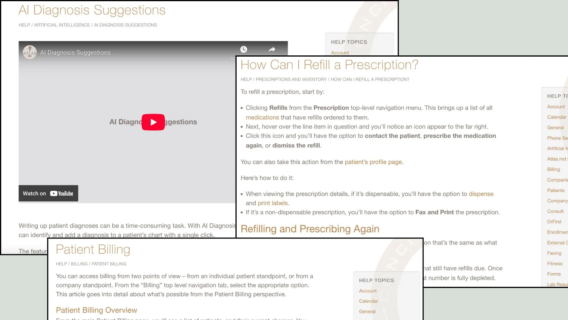
For that, I worked closely with developers and designers to build out this whole library of support content. The kind of stuff that helped doctors figure things out when they got stuck.
The developers would send me briefs about features, and my job was to make them as straightforward and intuitive as possible.
I wanted any doctor to be able to quickly adapt what they learned to their own workflow.
So the sales stuff stayed warm and human. The support docs stayed clear and practical.
Different jobs, different voices.
2. What Everyone Was Missing
Most EMR platforms were really focused on their features and integrations.
But there was this huge thing they weren't really addressing: doctors spend two additional hours on data entry for every single hour they spend with patients.
And 62% of physicians say it's the bureaucratic stuff that burns them out the most.
The frustration was right there, but it felt like nobody was really listening to it.
That's when it clicked for me. We weren't just selling software. We could sell doctors something they actually wanted back: their time. Their ability to spend more time with patients and provide the best possible care.
Their purpose.


4. Building It Out
Once I had that core idea, I worked on carrying the voice through the rest of the features.
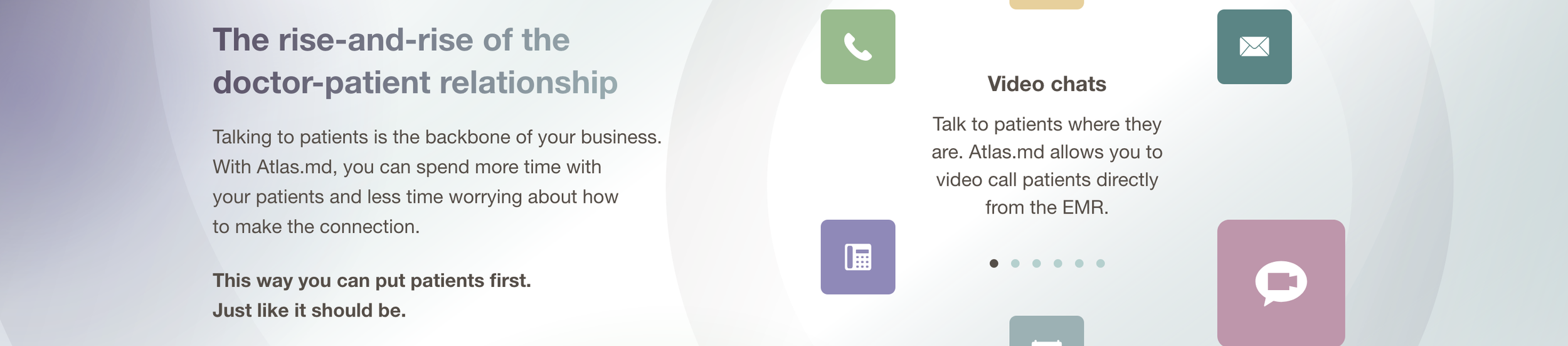
But instead of just listing features, I turned them into little stories:
"Like paper, but better."
"A data fortress."
"An EMR built around the doctor-patient relationship."
And so many more (check out the examples to the left).
Again, I didn’t just want to list what a feature did, but I wanted to demonstrate why it would help a doctor claw back their precious time and facilitate better connection with their patients.
6. Keeping the Conversation Going
Atlas.md was never really a static thing. It kept evolving as new features got developed and deployed.
Whenever we launched something new, we'd communicate it through in-app notifications, the blog, and our newsletter. I was in charge of creating the messaging for all three.
This was different from the support stuff. The voice had to stay human, conversational, informal.
Feature launches were less about the how and more about the why. Less about what the feature did and more about how it would save doctors time and let them connect with patients more.
Those same two pain points I originally came up with. We kept revisiting them again and again to keep the brand experience consistent.
The blog posts would always link over to support so users could read more about how a feature worked and see it for themselves.
It was like having two different conversations. One about possibility. One about practicality.
7. The Results
After we implemented everything, the site visits started climbing. Not overnight, but steadily.
The funny thing is, we never really set out to optimize for SEO. We just streamlined the copy, the brand voice, the pain points. And somehow, it all seemed to work naturally.
When you write clearly and focus on what people are actually searching for, the algorithms tend to notice.
Mailing list signups shot up too. People wanted to stay in the loop and read our newsletter. And the number of doctors actually taking the plunge into DPC and subscribing to Atlas.md went through the roof.
I think it helped that DPC adoption was jumping from 2% to 9% of family physicians between 2022 and 2023. The market was growing fast, and we'd positioned ourselves right where doctors were looking.
You know what they say about success - it’s when preparation and luck somehow find each other in the dark.